
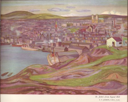
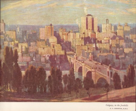
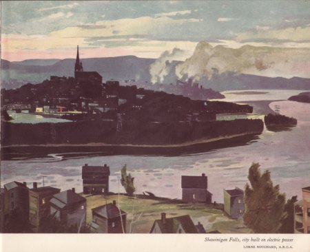
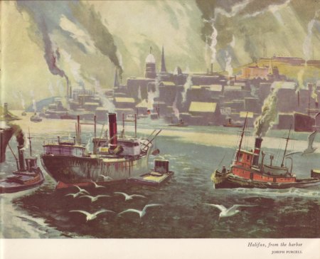
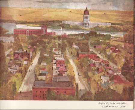
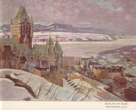
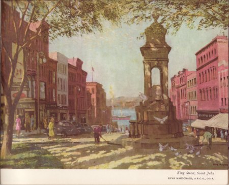
For Canada Day weekend, this post features images that span the geography of this vast country. Around 1953, in a grand display of national pride, the Montreal-based alcohol and beverage giant Seagram Company commissioned over a dozen Canadian artists (including several among the famed Group of Seven) to create a series of watercolors of major Canadian cities. The paintings were subsequently the focus of a world tour organized by Seagram to showcase Canada and its urban landscapes.
While recently rummaging through an antique shop I came across a small booklet, dating to 1953, in which these paintings were reproduced and for which this post shows a sampling of the now somewhat faded images. While many of the provincial capitals are depicted, I find the inclusion of several less prominent cities (including Fort William, Hamilton, Sarnia, Shawinigan Falls and Trois Rivieres) to be fascinating.

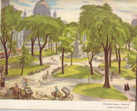


Depicts a very different world. Love the detail of the two nuns strolling in the Montreal one.
I agree. The ones with people and cars from that earlier period are catching.
I liked the subject matter. But I had a special interest today. After working in oils and acrylics, I just finished a course on watercolors. You are unusual in that many of your posts include the works of various artists, and I always enjoy seeing them.
Thanks! Great to hear about your painting, which is a terrific pursuit. I’ve played around with different painting media and I’ve found watercolor to be much harder than it looks.
These paintings are so telling. The places may have changed a lot since they were painted but the essence is still there. Love this post.
Darlene, so true. They’re a little hard to make out but if one is familiar with the places many things have changed over the past 60 plus years.
Beautiful. I am always amazed at the detail painters can include in watercolors.
Dan, me too. Watercolor is a tricky medium, especially for fine details.
Wow, really amazing! These paintings say more then many photographs!
That’s a great observation and one I think about a lot — the expressiveness of paintings vs. photography.
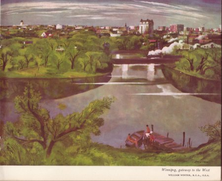
These are beautiful. Funny, cities like Fredericton have barely changed their key features. Kind of nice to see that beauty maintained. Thanks for sharing these
Plus ça change, plus c’est la même chose.
What a great idea for a Canada Day post.
🙂
What a find, Brett! Beautiful pieces. I’ve heard it said that watercolour is the easiest medium to use and the best for beginners, but having painted in oil, acrylic (my medium of choice), and watercolour, I find the latter the most difficult and the least forgiving, and would be my LAST recommendation for a new painter! So I have the utmost respect for artists who have clearly mastered the technique, like some of the ones featured here today.
Wendy, I’m with you on all of that. Watercolor seems the least messy for beginners but the hardest to control.
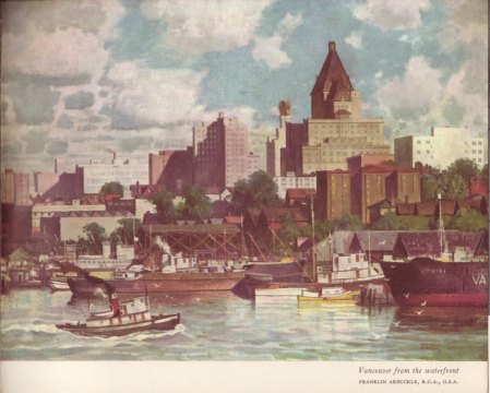
Great post, thanks! What a trip seeing my home town Vancouver as it was. I remember when the Vancouver Hotel was the most prestigious building on the downtown skyline.
🙂
I wonder what ever happened to this collection of paintings. Who has them now?
Good question. Probably scattered in different museums or private collections.
yes probably, if the painters are as you say Group of Seven, indeed in private or museum collections.
These are lovely paintings of a world long gone. I can’t imagine that Halifax is like that any more!
Yes, that city has changed quite a bit. 🙂
Great post……paintings bring history alive
Can be very true.
Thank you for introducing such a beautiful watercolor set of Canadian Cities. I love it.
🙂
Lovely aquarelles! Thank you for sharing!
Love that term “aquarelles”. Thanks!
In Finnish we use a same word akvarelli, just some different letters.
These are very, very cool. Thank you for sharing them.
Glad you like them! 🙂
Thanks for the great pictures, refreshing contrast compared to the delightful digital world we live in.
Thanks and that’s quite true. 🙂
The paintings are lovely and so interesting.
Very much so! 🙂
What a coincidence! I happen to own a copy of this book, inherited from my paternal grandfather! Apparently I used to sit on his knee (aged 3 or 4) and look at the paintings of the different cities with him – and it seems the one of Edmonton was my favourite owing to the presence of a locomotive!
My copy is now a little the worse for wear, with more than a few grubby fingerprints on the white covers (probably my own!).
The collection is a fascinating portrayal of Canadian cities as they appeared more than 60 years ago. The contrast to their present-day appearance is striking!
Many thanks for posting, Brett!
Richard, that’s a very nice personal connection to these images. Thanks for sharing that. I think the locomotive on the Edmonton painting stands out as well. I also noticed in looking back at the book that many of the pictures feature a locomotive in some way. Best, Brett
Love the Group of Seven. I have two prints but wish I had more!
Yes, they’re terrific! I’m sure the prints are wonderful.
Simply gorgeous, thank you for sharing.
🙂
The colours seem generally muted. Like the postcards of the time as I recall.
David, yes, seems that was the style then.
What a fascinating collection. The city looks so serene and peaceful. Ah…the steam boats…
Throwbacks like that are amusing.
Pingback: Opinionated Hot Links | Tacky Raccoons
Reblogged this on The Popcorn Daily.