Backroads Nova Scotia: Old Chevy Truck

aadsc_3627.jpg

Vintage Chevrolet Truck, Backroads of Annapolis Valley, Nova Scotia

~

I’m always thrilled when I come across a rusty old truck or auto from the early era of transportation and I have my camera handy.  This vintage Chevrolet truck, from about the late 1930s (my guess), was perfectly situated near a weathered garage down a meandering country road.  The distinctive front-end of this truck features an oversized grill, exaggerated fenders with standout headlights, and an iconic sleek hood ornament.  I spoke with the owner, who explained that he restored old vehicles.  So this vintage beauty may yet roll along the road again and turn a few heads as it does.

Vintage Chevrolet Truck, Backroads of Annapolis Valley, Nova Scotia

~

Vintage Chevrolet Truck, Backroads of Annapolis Valley, Nova Scotia


Similar Posts on O’Canada:

~ Cool Vintage Junkyard for Sale

~ Old Farm Tractor Along Charlevoix / St. Lawrence Shore

~ Broke-Down Farm Equipment


Building the Toronto Subway: John DeRinzy’s Art

John DeRinzy, Three Men With Jack Hammers (1950)

~

Unless you were around when it was built (I wasn’t, by the way!), it’s difficult to imagine how massive an undertaking it was to build Toronto’s subway system.  Shortly before it’s opening in 1954, local artist John DeRinzy, who worked as a graphics designer for Simpson’s department store (later part of the Hudson’s Bay chain), documented the progress of this major public works project in a series of watercolor and charcoal landscapes.  His inclusion of workers in these images helps the viewer to connect emotionally to the scenes depicted.  They are reminiscent of the style displayed by public art of the New Deal era a couple of decades earlier in the U.S.   (DeRinzy’s work also brings to mind Caven Atkins’ painting “Arc Welder Working on Bulkhead” (1943), which can be seen in this 2013 O’Canada post.)

More background on these images can be found in the City of Toronto Archives here.

John DeRinzy, Underground Utilities, Yonge Street (1949)

~

John DeRinzy, Welder (1950)

~

John DeRinzy, Men Excavating in Timber Lined Trench (1950)

~

John DeRinzy, Man With Jack Hammer (1950)


Image Credits: John DeRinzy; City of Toronto Archives

Eric Goggin’s Inviting Travel Posters of Atlantic Canada and Beyond

Travel posters at their best showcase memorable places in distinctive ways as well as the talent of remarkable artists.  A case in point is the beautiful series of travel posters by Salisbury, New Brunswick-based graphics designer Eric Goggin.  The stylized design, bright colors and buoyant fonts are all fun.  Many of Goggin’s posters have a pleasing vintage feel to them and focus on locations throughout Atlantic Canada.

While well-known cities and areas, such as Gros Morne, St. Andrews By the Sea, Cape Breton and the Bay of Fundy, are featured, Goggin also directs some of his artistry to lesser-known but still picturesque locales, including Cape Forchu, N.S., Shediac, N.B., and Cavendish, P.E.I.  Of course, because they are travel posters they fulfill their principal purpose by inviting curiosity and wonder about the places depicted and make the viewer itch to get on the road to see these sites.

You can see more of Goggin’s terrific poster designs on his DestinationArt website here.

~

Eric Goggin, Shediac

~

~

~

~

~

~

(Images Credit: Eric Goggin)

Similar posts on O’Canada:

¤ Cameron Stevens’ Vintage-Style Canada Parks Posters

¤ Magnificent Travel Art of the Canadian Pacific Railway

¤ Retro Winter Recreation and Travel Ads

Vintage Magic in PEI: Ice Boat Rarities and Island Uniquities

~

Not far from the Confederation Bridge on the Prince Edward Island side of that engineering marvel a scenic backroad leads to the cozy town of Cape Traverse and two of the best antique shops in all of Canada’s Maritime Provinces: Ice Boat Rarities and Antiques and, its sister shop, Island Uniquities and Antiques, which is just a few hundred yards away down PEI Route 10.   Both shops are housed in 19th century buildings — one an old church  and another a former masonic lodge — that have been masterfully restored and updated by owners Larry and Jane Dugdale.

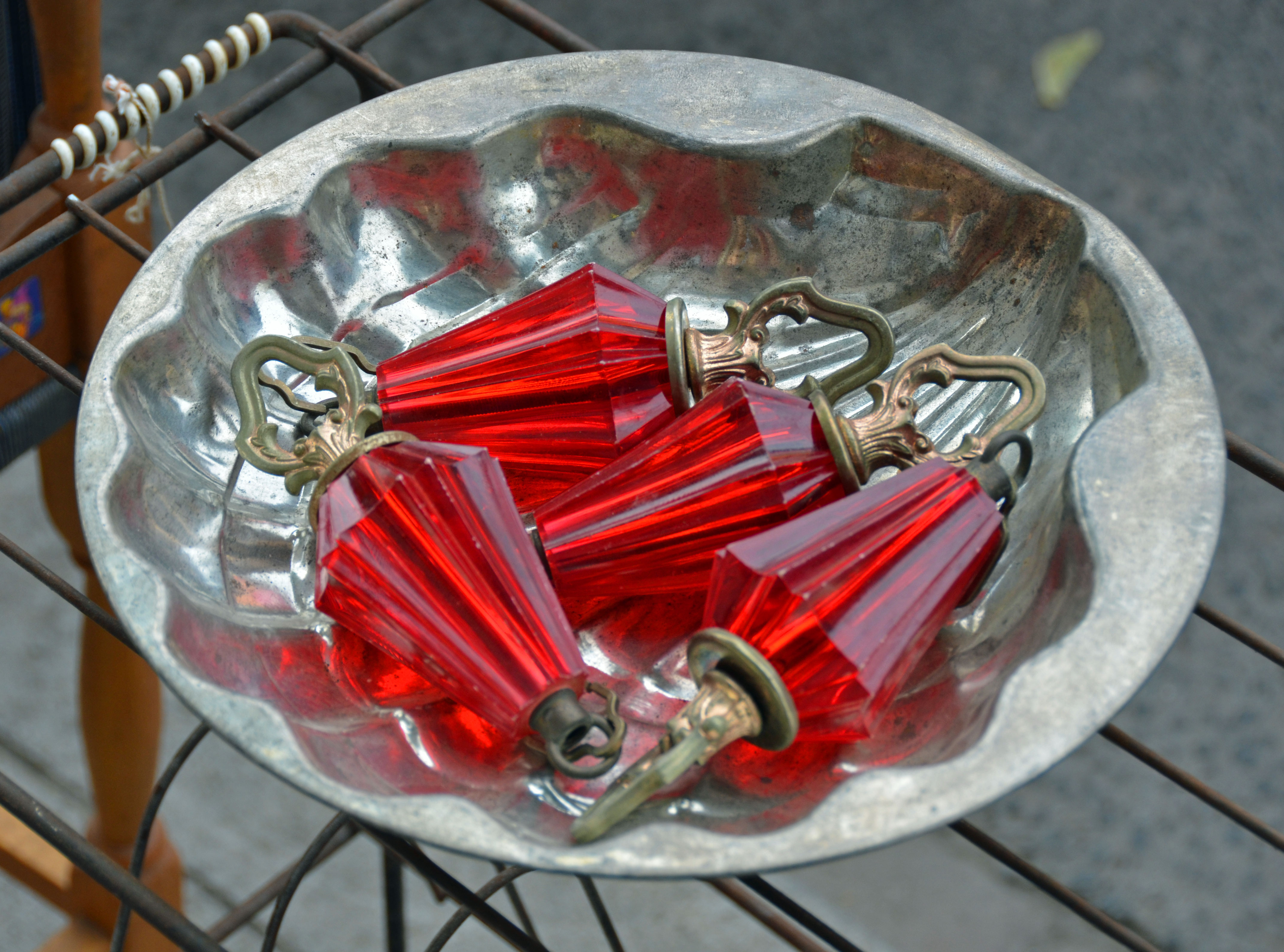
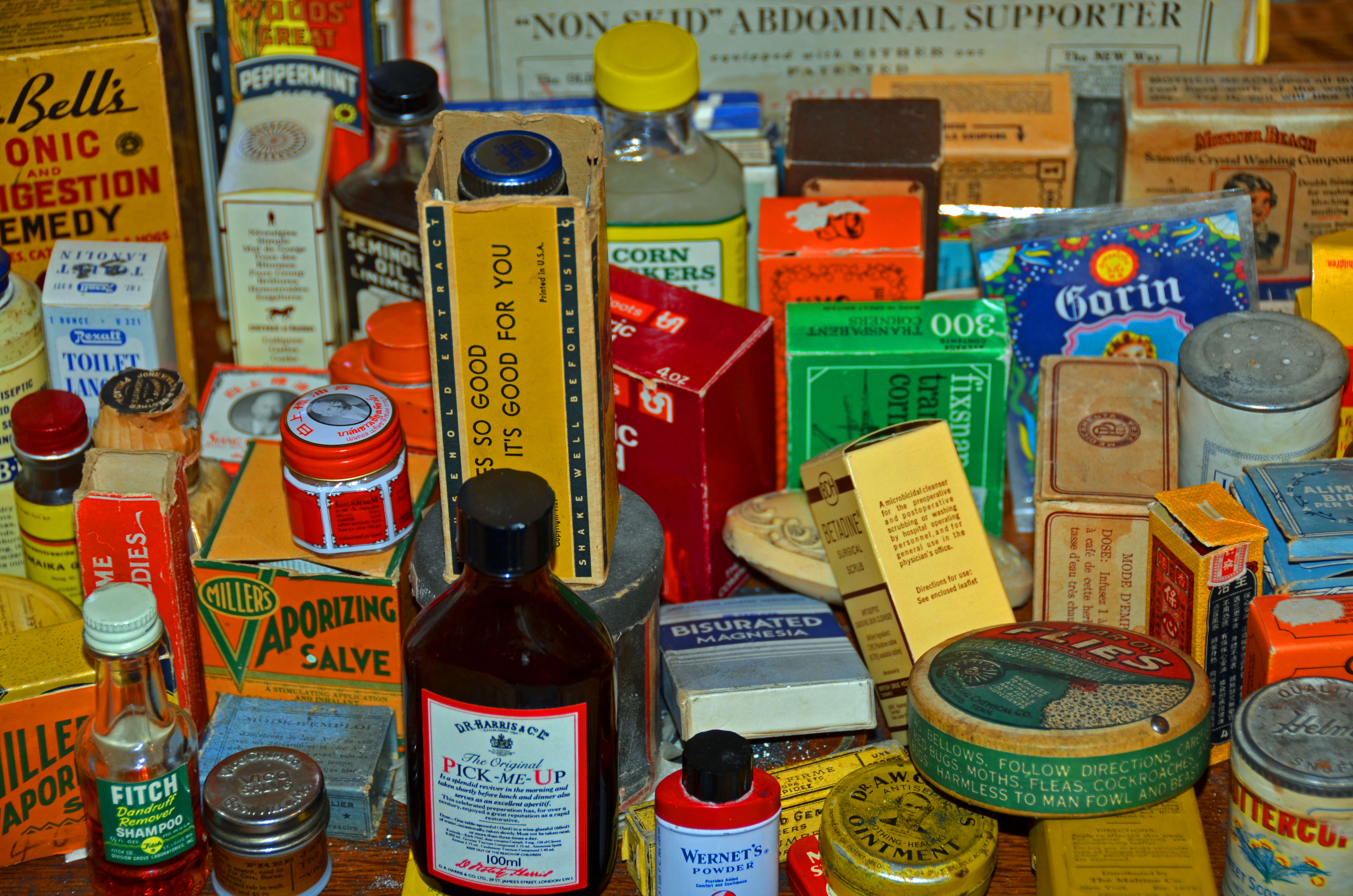
The exceptional assortment of antiques, curios, artwork and furniture on offer started as a personal collection of the owners that eventually morphed into the well-organized groupings that seem intentionally curated for visual delight.  The Ice Boat building features the former church’s simply designed but stunning original red, blue, green and yellow stained glass windows, which cast a warm, luminous glow throughout the place.  These shops deserve to be called galleries as much as anything else.

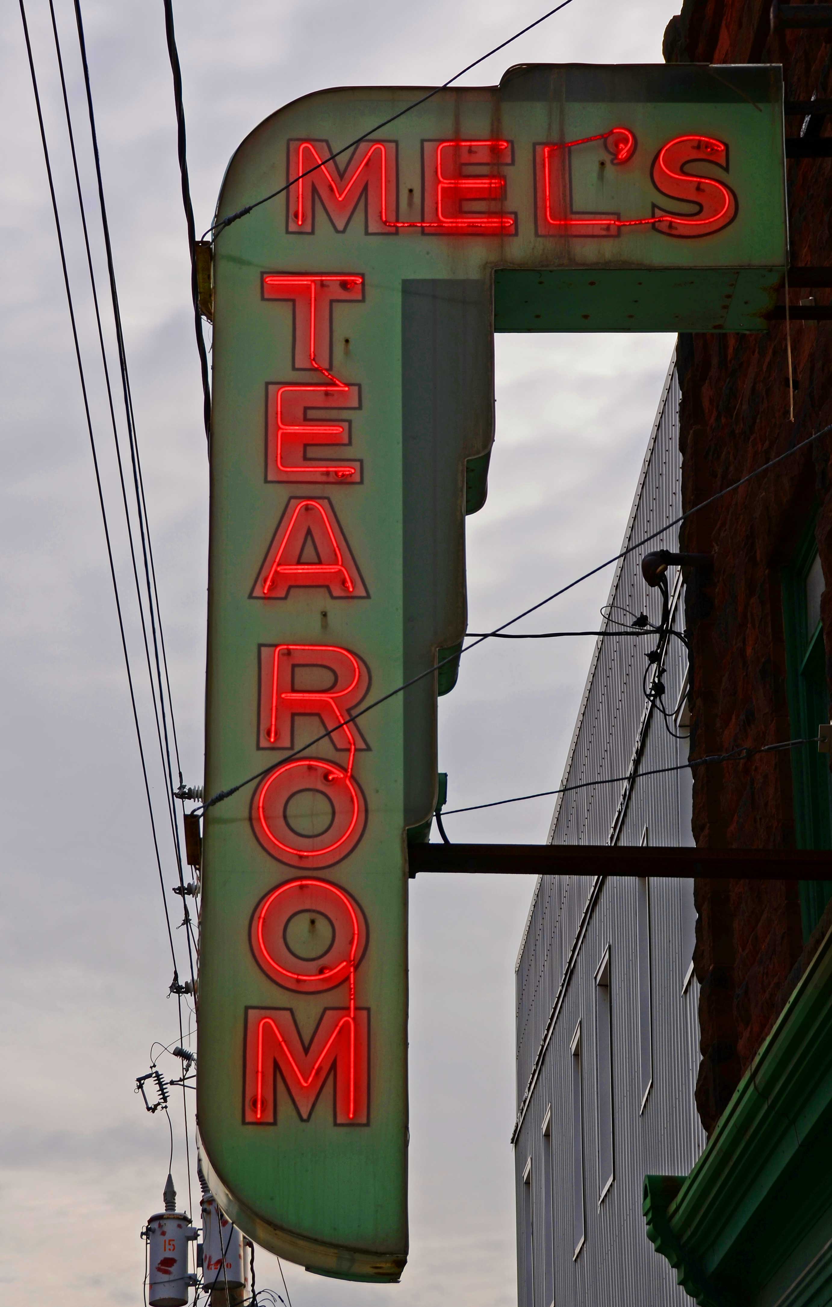
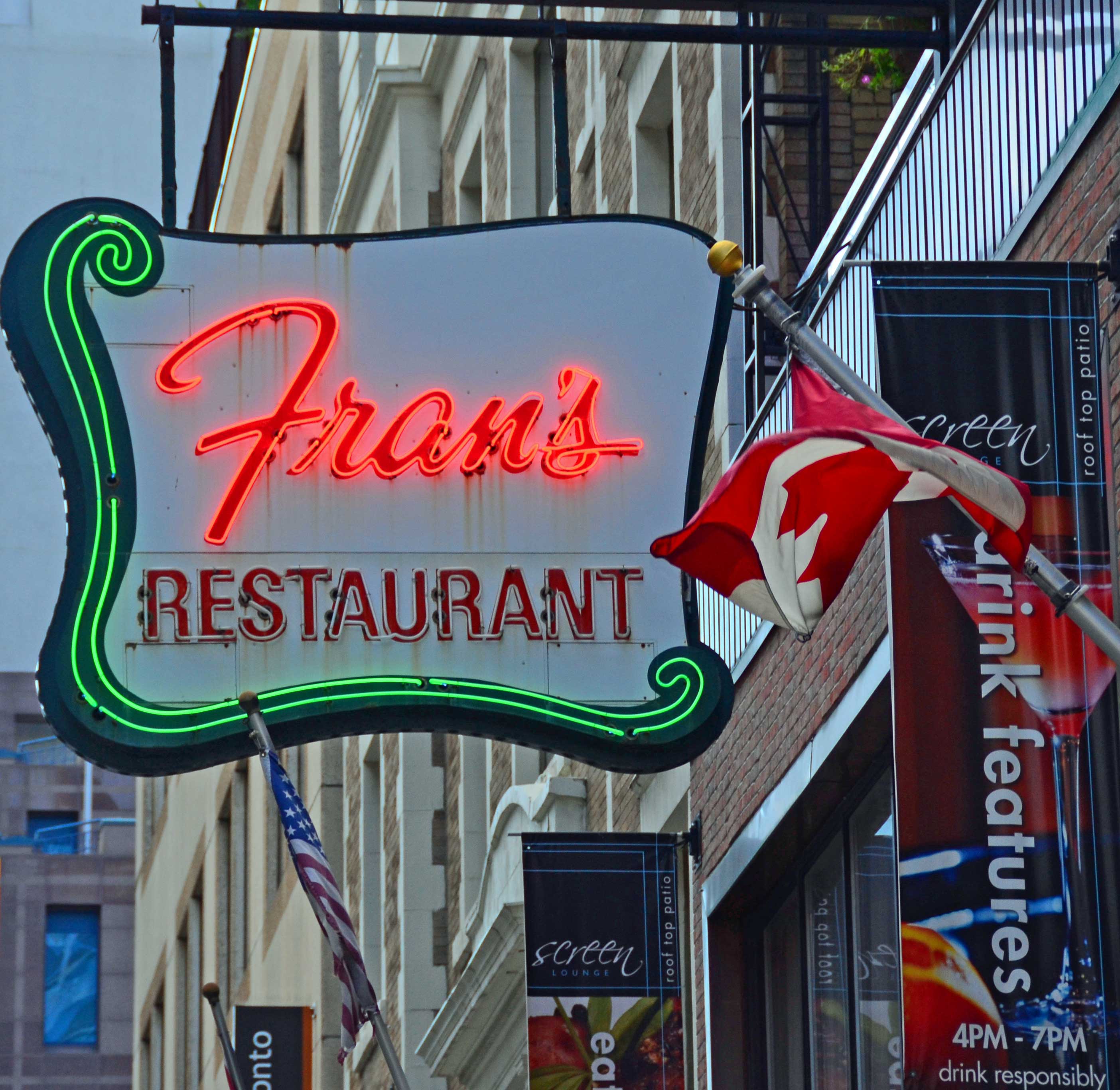
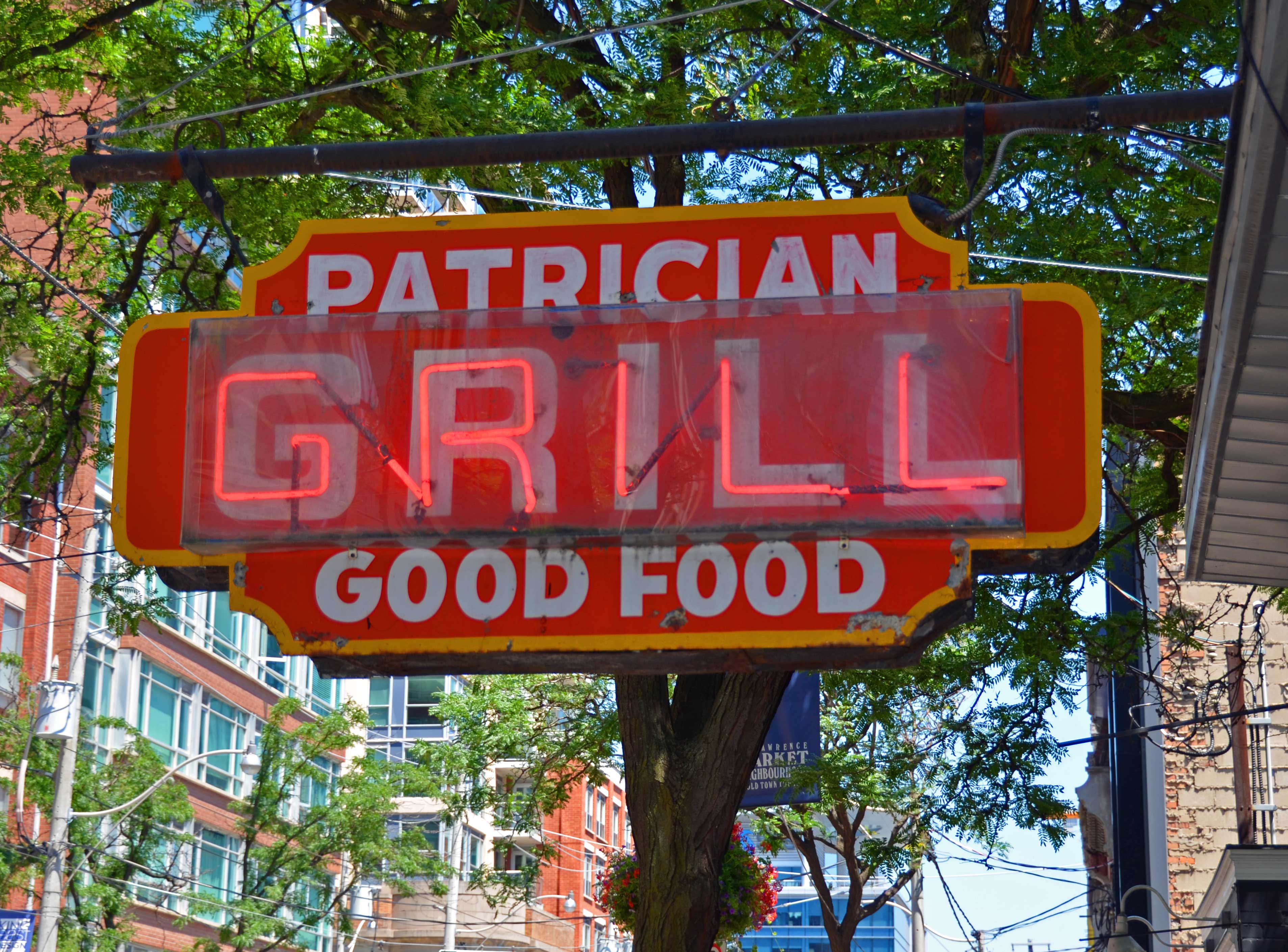
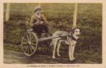
If you’re into stylish old or reclaimed furniture, these shops have you covered; automotive and industrial neon, check; vintage toys, thermometers, oil cans, model boats, duck decoys, postcards and ephemera, tools or farm implements, check to all that too — and a great deal more!  Of particular note is the collection of whimsical painted wood sculptures and other artworks by noted PEI folk artist, Kerras Jeffery, who sadly passed away last year at way too young of an age after battling a long illness.  The Ice Boat Rarities shop serves as almost a museum of some of his brightly colored pieces and the shop also features a marvelous cloud-painting by Jeffery on the ceiling of its largest room.

In addition, the staff in both places are super friendly and helpful and the prices are about the fairest I’ve seen for antique shops anywhere.  These places are definitely worth a visit if you find yourself nearby.

More information about these terrific shops can be found at their respective Facebook pages here: Iceboat Rarities and Island Uniquities.  More about Kerras Jeffery and his art is available on the Backroad Folkart blog here, which was formerly written by him and is now maintained by one of his relatives.

~

~

~

~

Similar posts on O’Canada:

  Cool Vintage Junkyard for Sale

♥  An A++ for Toronto’s Gadabout Vintage

♥  Fred Herzog’s Vintage Vancouver

Cameron Stevens’ Vintage-Style Canada Parks Posters

Cameron Stevens is a hugely talented graphics designer working in Ontario.  Several years ago he embarked on a project to design vintage screen-printed-style posters for a number of Canada’s national and provincial parks.  A few years later he’s now up to 58 gorgeous posters, each of which is characterized by a spare, consistent layout and muted pastel tints as evidenced by the sampling shown here.  Whether intentional or not, most also include a body of water, which is certainly reflective of the vast number of lakes, rivers and sea coasts throughout the country.

On his official Canada’s Parks poster art site, Stevens notes that he was inspired by the artwork produced by the U.S. Works Progress Administration (WPA) in the 1930s and 1940s to promote America’s National Parks.  His Canada Parks posters clearly harken back to that earlier era, as well as the time when the Canadian Pacific Railway blanketed the country with its highly stylized travel posters.  These contemporary posters with a vintage feel are beautiful to behold while bringing well-deserved attention to many of Canada’s spectacular outdoor treasures across its provinces and territories.  Stevens sells these as posters and prints, which can be accessed through the above official poster site and his graphics site.

~

~

~

~

~

~

(Images credit: Cameron Stevens)

Similar Posts on O’Canada:

~ Retro Winter Recreation and Travel Ads

~ Magnificent Travel Art of the Canadian Pacific Railway

~ Let’s Visit Ontario

~ Go By Air With TCA

The Daring Canadian Pulps: Oh, My!

Spurred on by a wartime ban on the importation of non-essential foreign goods, including the lurid magazines from below the 49th parallel commonly referred to as “pulps”, the Canadian pulp magazine industry flourished during World War II and the decade after.  Like all good pulp publications, the featured stories often blurred the lines between fiction and reality and routinely served up tales that were risque, grisly, shocking and as often true as not.  Avid readers ate up this stuff!

Adding to its diverse holdings, Library and Archives Canada acquired in the late 1990s a core collection of pulp magazines dating back to the golden post-War era of such publications.  These cover images are from the Archives’s fascinating “Tales From the Vault” exhibition.  Of these covers, I think my favorite might be the fairly simple red-and-black layout above that promises dirt on a Vancouver cult and Winnipeg’s pock-marked Frankenstein. I’ll bite!


The Good Old Days: Rural Life in Vintage Postcards

Hay Making, Nova Scotia (about 1960)

~

Out in the country people work hard, and back in the proverbial good old days they worked even harder.  Whether on a farm, a fishing village or in the forest, rural folk have always had to put their bodies and souls into their labors to eke out a living.

As these vintage postcards from the eastern parts of Canada attest they at least did so amidst beautiful settings.

River Saguenay at Chicoutimi, Quebec (about 1940)

~

Rural----Ox-Cart-1

Ox Cart, Rural Quebec (about 1940)

~

Spinning in Rural Quebec (1950)

~

Back of Spinning in Rural Quebec (1950):   “Dear Ma – That’s you and me working. Lots of little farms and little houses here. Horses do most of the work. Farms are very small. In winter the men work in the lumber business, in summer farming. Women do fancy work in winter to sell it in the summer. Love Helen”


Similar posts in O’Canada:

⊕  Quebec Charm in Vintage Postcards

⊕  “Dear Auntie . . don’t be cross”: Scenic British Columbia in Old Postcards

⊕  Moonlit Views of Yesteryear Canada

Fred Herzog’s Vintage Vancouver

Fred Herzog, Bogner’s Grocery (1960)

I’ve seen the street photography of Fred Herzog previously but a brief essay by Geoff Dyer in today’s New York Times Magazine prompted me to look anew at Herzog’s work.  Herzog came to Canada in the early 1950s from Germany and from the late 1950s through the 1960s pioneered color street photography in his adopted city of Vancouver.  His candid shots provide a splendid if unvarnished documentary of the city and its people during that period.  The vintage images also subtly illustrate many things that have changed in Vancouver and other urban areas throughout Canada (and America) in the past several decades.

More of Herzog’s work can be seen at Vancouver’s Equinox Gallery and on its website.

Fred Herzog, 2nd Hand Store Boy (1959)


Fred Herzog, Alexander Street (1967)


Fred Herzog, Granville Street from Granville Bridge (1966)


Fred Herzog, Granville/Robson (1959)


Fred Herzog, White Lunch Granville (1959)


Photo Credits:  Fred Herzog and Equinox Gallery

Similar Posts on O’Canada:

⊕  Vintage / Mod Design: The City Bus

⊕  Love These Vintage Neon and Bulb Signs

⊕  Regent Gas Station and Sleek Modern Design

Vintage Cover Art: The Goblin

Prior to the great stock market crash at the end of the decade and the ensuing economic chaos, the prevalent mood of the 1920s in many places was upbeat and carefree. Magazine covers from the era typify this, including these fabulous illustrations from Canada’s Goblin, a monthly humor magazine.  Launched in 1921, it was in print for about ten years during which time its highly stylized, and at times witty, covers helped it to become Canada’s then most widely circulated magazine.

~

~

~

~

~

~

(Image Source:  University of Toronto Archives)

Vintage Tools From 1912 Hardware Catalogue

Wrenches2

Because I love doing projects that involve hand tools I probably have way more than any reasonable person should have.  But if you work enough with your hands you know that the right tool makes all the difference.  Traditional hardware stores are now a dying breed of retail but back in the day they were the one-stop shop for most tool needs. The McLennan, McFeely & Co. Hardware Store opened in Vancouver in 1885 and for many years was a substantial business enterprise.

These pages are from that merchant’s 1912 catalogue.  Among the wrenches above, the crescent adjustable wrench must have made quite a splash because it was only first introduced around 1907 and to this day is a standard in any well-equipped tool box. Though less common nowadays, variations of the hand drills pictured below can still be found today and are quite useful.

The City of Vancouver Archives has digitized some of the old McLennan, McFeely catalogues, and flipping through the pages makes for an interesting diversion as you ponder how much more laborious it was to do various chores over a century ago.

Hand Drills

Cool Vintage Junkyard For Sale

I came across a news story that led me to a real estate listing for a well-organized junkyard in Tappen, British Columbia with over 300 vintage cars and trucks crammed into 5 acres.  Along with the land comes a few buildings and all of the classic junkers to boot.  Asking price is almost CDN $1.5 million!

The colorful pictures taken by the selling real estate agency (Century 21 Agent Hudson Purba) are superb, several of which are posted here (more can be viewed on the listing site).  This throwback reminds me of Old Car City in northwest Georgia, a salvage yard dating to the 1930s which is filled with truly old rusty vehicles that Mother Nature has slowly reclaimed. Both places are full of eye-candy for photographers and the just plain curious.

(Image credits:  Century 21 Agent Hudson Purba)

“Now! All Together”: Songs From Long Ago

Songbooks fascinate me, particularly when they highlight song variations from earlier times.  So while browsing through a dusty stack of materials in a used bookstore a few months ago I was drawn in by this 8-page vintage booklet of songs, which was printed as a promotion around 1930 by the Dominion Life Assurance Company of Waterloo, Ontario.

This bit of ephemera is spare of graphics and contains a wide variety of songs, including songs specific to Canada (such as “O Canada!” and “Alouette”), American standards (“Home on  the Range” and “She’ll Be Coming’ Round the Mountain”), and songs indicating the then closer historical connection to Great Britain (“God Save the King” and “Loch Lomond”).  A few of these have lyrics that would not be considered racially sensitive but presumably reflected the time back then.   It’s an interesting mix of tunes, many that I’ve not heard in ages and others for which I only knew a line or two of the lyrics.

(Click image to enlarge)

Similar posts on O’Canada:

Songs & Ballads From Nova Scotia

Regent Gas Station and Sleek Modern Design

Regent Gas Station (Left View), Toronto (1949),
Designed by John Parkin, Photo by Hugh Robertson

Although these vintage images only showcase a humble gas station they’re amazingly good! That’s because they combine the modernist industrial design of distinguished Toronto architect John Parkin and the often-dramatic photography of Hugh Robertson and his team at Toronto’s former Panda Associates firm, both of whom helped popularize modern design in Canada during the 1950s and 60s.

Regent Gas Station (Right View), Toronto (1949),
Designed by John Parkin, Photo by Hugh Robertson

A trove of other vintage architectural photos can be seen at the Panda Associates Digital Image Collection, Canadian Architectural Archives, which is maintained by the University of Calgary, and in the book John C. Parkin, Archives and Photography: Reflections on the Practice and Presentation of Modern Architecture (University of Calgary Press 2013).

(Image Credits:  Hugh Robertson/Panda Associates, Canadian Architectural Archives, University of Calgary)

The Calgary Stampede: “A Romping Rangeland Rumpus”

Calgary Stampede 1912
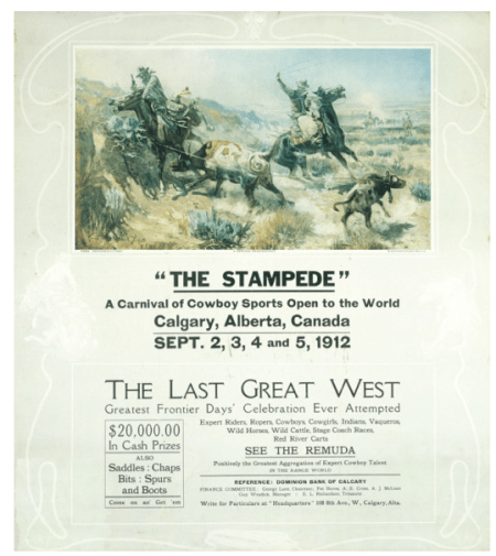
Poster from First Calgary Stampede in 1912

Many people associate Calgary, affectionately nicknamed “Cowtown”, with its annual summer Stampede in the same way that a place like New Orleans is tied to Mardi Gras. The character of those places seems inextricably linked to these major civic festivals. Prior to the area’s post-WWII oil boom, Calgary was predominantly an agricultural area and held a traditional yearly agricultural fair called the Calgary Industrial Exhibition.

The Stampede was conceived in 1912 by an American rodeo promoter, Guy Weadick, as a way to add a cowboy-themed element to the fairly staid farm-focused Exhibition.   After some fits and starts the two events combined in 1923, with the Stampede under Weadick’s longtime guidance eventually overshadowing the Exhibition.   Ever since, the cowboy theme has stuck with Calgary even though agriculture, farming and ranching are now only a very small part of its economy.   This year’s Stampede will take place July 7-16 and, as can be seen on the official Stampede site, will be quite a spectacle with something to offer just about everyone.


Image Credits:  Calgary Stampede Archive, University of Calgary

“Dear Auntie . . . don’t be cross”: Scenic British Columbia in Old Postcards

gorge-bridge

Postmarked July 12, 1921 (Note Is Below)

Back in the day writing letters and cards was the routine thing to do if you wanted to stay in touch with distant friends and relatives. Picture postcards also allowed the recipient vicariously to experience what the sender did and saw.  As suggested by the note below on one of these cards of British Columbia, the folks back at home expected a long form letter if possible and sending only a postcard from a trip was an occasion for an apology (being Canadians and all). 🙂

gorge-bridge-note-side

Note Side of Card Above of Gorge Bridge, Victoria, B.C.

~

yoho-glacier

Yoho Glacier, near Field, B.C. (About 1910)

~

simash-rock

Simash Rock, Stanley Park, Vancouver, B.C. (About 1905)

~

seven-sisters

Seven Sisters, Stanley Park, Vancouver, B.C. (About 1910)

~

lynn-canyon-bridge

Lynn Canyon Suspension Bridge, Vancouver, B.C. (About 1915)

~

fraser-river

Fraser River, Yale B.C. (About 1910)

~

capilano-suspension-bridge

Capilano Suspension Bridge, Vancouver, B.C. (About 1951)

Vintage Picture Map Geography of Canada

nw-territories

I recently came across a copy of an old school book, “Picture Map Geography of Canada and Alaska” by Vernon Quinn, that includes charming woodcut picture maps by Bruno da Osimo, a then noted Italian illustrator, for each of the Canadian provinces (other than Nunavut, which was then part of the Northwest Territories).  Originally published in 1944 and updated in 1954, it has a light but well-written chapter devoted to individual provinces.  Each map features animals, plants, activities and industries peculiar to the province depicted.  In addition to the maps (scanned in above and below), the book is adorned throughout with other delightful illustrations by da Osima (some of which I’ll compile in a future post).

alberta british-columbia manitoba-saskatchewan newfoundland nova-scotia-new-brunswick-pei ontario-2 quebec yukon


Similar Posts on O’Canada Blog:

1933 Quebec Tourist Road Map

Old Maps and Their Hidden Stories

Songs & Ballads From Nova Scotia

Vintage / Mod Design: The City Bus

vancouver-bus-4

City Bus on Vancouver Street (about mid-1950s)

Distinctive industrial design reveals itself in many ways and, when done well, can be a genuine pleasure to take in.   While the specialness of such design is often difficult to see in our contemporary surroundings, its otherwise subtle impact jumps out when looking back at vintage images. A case in point: the humble municipal bus, operated in Toronto, Montreal, Vancouver, Calgary and other cities across Canada.  Over this period theses buses began to display a very mod sensibility as they evolved from the severe boxiness of earlier 1930s and 1940s versions to later, during the 1950s through the 1970s, being adorned with more rounded contours, sleek curves and very stylized lines and chrome elements.

Joy of the Blues

Nfld -- Boat on Grass

Small Fishing Boat, Near Port Rexton, Newfoundland

I love playing around with themes.  In an earlier post, I grouped together a bunch of my photos from across Canada that featured a strong element of red.  Today, I thought I’d do a similar thing with some photos that incorporate blues (of the uplifting kind).

The Atlantic Advocate – Part 1: Vintage Trade and Tourism Ads

Newfoundland Trademarks

The Atlantic Advocate was a general interest magazine published monthly from 1956 through 1992 with a focus on life, culture and business in the four Atlantic provinces — New Brunswick, Newfoundland, Nova Scotia and Prince Edward Island.  While browsing through a stack of issues from the late ’50s and early ’60s, one of the things that stood out to me was the enthusiastic boosterism of many ads promoting economic development and tourism in those places.  The fact that ads of this nature are so prominent in a general interest publication is partly a testament to the economic challenges long faced by the Maritimes and an appreciation by their relatively small populations of the significant impact of industry and natural resources development on daily life in their regions.


Mod Design: Vintage Postcards of Expo 67

Forest Pavilion

Canada Forestry and Paper Pavilion

With the Rio Summer Olympics being just around the corner this prompted me to ponder the differences between the Olympics and the World Fairs.  While both are cultural showcases that bring together people of many nations to good-naturedly preen about their countries, World Fairs seem more ad hoc than the more structured, media spectacle of the Olympics.

Coinciding with Canada’s centennial in 1967, Montreal hosted what is considered to be one of the most successful World Fairs, which was the first to adopt the “Expo” moniker by which all subsequent World’s Fairs have been named.  As attested by these postcards, the various national pavilions at Expo 67 served as grand displays for then cutting-edge, very “mod” design and innovation.

Canadian Cities in 1950s Watercolors

Edmonton

For Canada Day weekend, this post features images that span the geography of this vast country.  Around 1953, in a grand display of national pride, the Montreal-based alcohol and beverage giant Seagram Company commissioned over a dozen Canadian artists (including several among the famed Group of Seven) to create a series of  watercolors of major Canadian cities. The paintings were subsequently the focus of a world tour organized by Seagram to showcase Canada and its urban landscapes.

While recently rummaging through an antique shop I came across a small booklet, dating to 1953, in which these paintings were reproduced and for which this post shows a sampling of the now somewhat faded images.  While many of the provincial capitals are depicted, I find the inclusion of several less prominent cities (including Fort William, Hamilton, Sarnia, Shawinigan Falls and Trois Rivieres) to be fascinating.

St. John's

Calgary

Shawinigan Falls

Charlottetown

Halifax

Montreal

Regina

Quebec City

Saint John

Hamilton

Vancouver

Toronto

Winnipeg

Windsor

Quebec Charm in Vintage Postcards

aaCartier Market

Jacques Cartier Market, Montreal, Early 1900s

~


Similar Posts on O’Canada:

• Bridges As Depicted in Vintage Postcards

• “Having a swell time . . .”: Vintage Hospital Postcards

• The Great Canadian Outdoors: Vintage Rockies Postcards

• Ever-Bustling 20th Century Toronto

• Vintage Quebec:  Ox Carts, Dog Carts and Sleighs

Eric Bergman: Master Wood Engraver

H. Eric Bergman, "White Morning" (1932)

H. Eric Bergman, “White Morning” (1932)

The intricate artistry of wood engravings amazes me and Canada has its fair share of accomplished artists in this medium. Chief among them is H. Eric Bergman, who emigrated from Germany in 1913 and made Winnipeg, Manitoba his home throughout a highly productive career until his passing in 1958.  Images from the Canadian wilderness figure prominently in many of his very stylized and moody works.

Similar posts on O’Canada: 

Lisa Brawn’s Vibrant Woodcuts

Laurence Hyde’s Southern Cross

Early U.S.-Canada Political Cartoons

Given that Canada just had a memorable election and the U.S. is still in the throes of its year-plus presidential campaign marathon, this seems to be a good opportunity to interject a smidgen of politics into the mix.  But not too heavy —  so let’s look at some early pop culture.

I'll CatchPolitical cartoons depicting relations between Canada and the U.S. extend back to the founding days of both countries. The images depicted here, from the late 1890s through early 1900s, mostly play on a recurrent theme of the U.S. being attentive or aligned with Canada for reasons that were alternately virtuous or of a more self-interested intention.  With Canada then still firmly part of the British Empire, Britain also figured prominently in many such scenes from this period.

Dangerous

~

Interrupted

~

Flirtation

~

Pertinent

~

Money Bags

~

aQuestion-of-Time

Acadia Theatre’s Classic Neon Splendor!

aDSC_1713

I like vintage signs a great deal, especially classic neon displays that have been well preserved.  These shots taken yesterday show The Acadia Theatre in Wolfville, Nova Scotia, which is graced with a magnificent masterpiece of neon and signage art above its entryway.   The triangular sign juts out from the building’s facade with “ACADIA” in bright yellow on two sides and white and yellow neon accent lines all around and a bold neon yellow star encircled atop the front.

Built in 1911, this Annapolis Valley theatre has been through several incarnations and now houses a cinema and stage for community theatre (the Al Whittle Theatre), a film society (the FundyFilm Society), a local coffee shop / cafe (Just Us!) and an art gallery (Jack’s Gallery).  More info can be obtained at the Acadia’s site here.

aDSC_1721 aDSC_1726

Some other posts about signs on O’Canada:

∗ Love These Vintage Neon and Bulb Signs!

∗ Artist Appreciation: Andrew Horne

∗ On the Street Toronto: Fun & Unusual Signs

∗ “Mel’s Tearoom” – Finished

“Mel’s Tearoom” — Finished

aDSC_1351----Mel's-Tearoom

Brett Lockwood, “Mel’s Tearoom, Sackville, N.B. (2015)

(Acrylic on Board, 32″x 48″)

In the recent past I’ve not picked up my paintbrushes as often as I’ve used my ever-dependable Nikon.  But something about the vintage neon sign hanging outside the Mel’s Tearoom diner in  Sackville, New Brunswick and the photo (below) that I snapped of it a while back (earlier post here) inspired me to translate that image onto canvas — with some usual artistic license along the way. Perhaps seeing Toronto artist Andrew Horne’s marvelous takes on classic signage from bygone eras both online and at his Flying Pony gallery in Toronto contributed as well.  In any event, the result is above (photo is a bit crooked), which I’ve happily finished and wrapped with a handmade floating frame.  Efforts at painting like this are good meditative exercises and always enhance my appreciation for the skill and creative expressions of professional artists.

wwwDSC_9390

Inspiration Photo for Painting

They’re Giving Away Land!

Farm----2-New-Homeland

Back in the day, Canada needed more people to build up its country and, in particular, in its vast western inland plains. With lots of land and not so many people, the federal and provincial governments and land companies starting in the late 1800s on into the early twentieth century launched  recruitment campaigns  around the world, especially in Europe, with the lure of free land grants and the potential for prosperity.  The distance was far and farm life was (is!) tough, but the appeal drew many new immigrants to Canada’s west.   I love the variety and details in some of these posters! (Click on images to enlarge)

“Having a swell time . . .”: Vintage Hospital Postcards

zGeneral-Hospital-Montreal

Postmarked 1913.  A cozy looking place.

Hospitals seem a peculiar and dreary subject for postcards.  But back in the day — before routine outpatient procedures and hospitals speedily freeing up beds — time in hospital (as patient or visitor) regularly spanned several days or longer, so penning a brief note to update absent friends or loved ones was probably not so odd.  And what better way to do it than with one of the colored cards conveniently available at the hospital!

zGeneral-Hospital-Saint-Joh

 Postmarked 1945. The note starts out: “Having a swell time.”  Love those roadsters!

~

zOntario-Hospital

About 1948.  Yikes — looks more like a prison!

~

zRoyal-Victoria-Hospital

About 1910.  Regal digs.  Notice horse and buggy to bottom left.

~

zToronto-General-Hospital

 Postmarked 1935.  Street car or bus passing by.

The Great Canadian Outdoors: Vintage Rockies Postcards

eLake-Louise,-Alberta

 Lake Louise & Victoria Glacier — About 1949

It’s safe to say that when many Americans think of Canada they visualize vast expanses of nature and, in particular, the Canadian Rockies.  These vintage postcards — most of which are colored photos — feature scenes of the Rockies in Alberta, spanning the early 1900s up to the early 1960s.

eAthabasca-Glacier,-Alberta

Athabasca Glacier — About 1960 (Love that funky snow bus!)

___

eBow-Valley,-Alberta-2

Bow Valley, Banff — About 1950s

___

eBow-Valley-Postcard

Bow Valley, Showing Golf Course — About 1950s

___

eCascade-Mountain,-Alberta

Cascade Mountain, Banff — Early 1900s  (This was quite a ride then in a horse drawn carriage.)

___

eCascade-Mountain,-Alberta-

Cascade Mountain, Banff — 1920s

___

eWind-Mountain,-Alberta

 Wind Mountain, Alberta — About 1910s

Love These Vintage Neon and Bulb Signs!

aDSC_1139

Mixed in among modern urban streetscapes, the look and feel of the rare classic neon and bulb-lit signs are distinctive. I spied these in Toronto and one in New Brunswick (the fabulous sign for Mel’s Tea Room!), which happily stand the test of time.

DSC_0786

~

DSC_0743

~

wwwDSC_9390

~

DSC_0965

~

DSC_1198