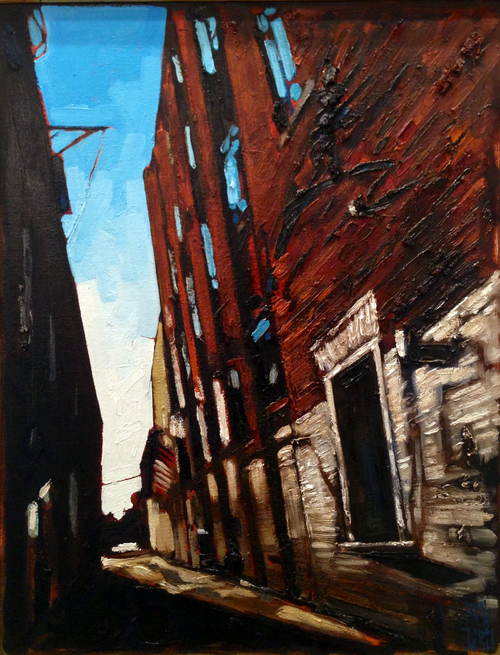
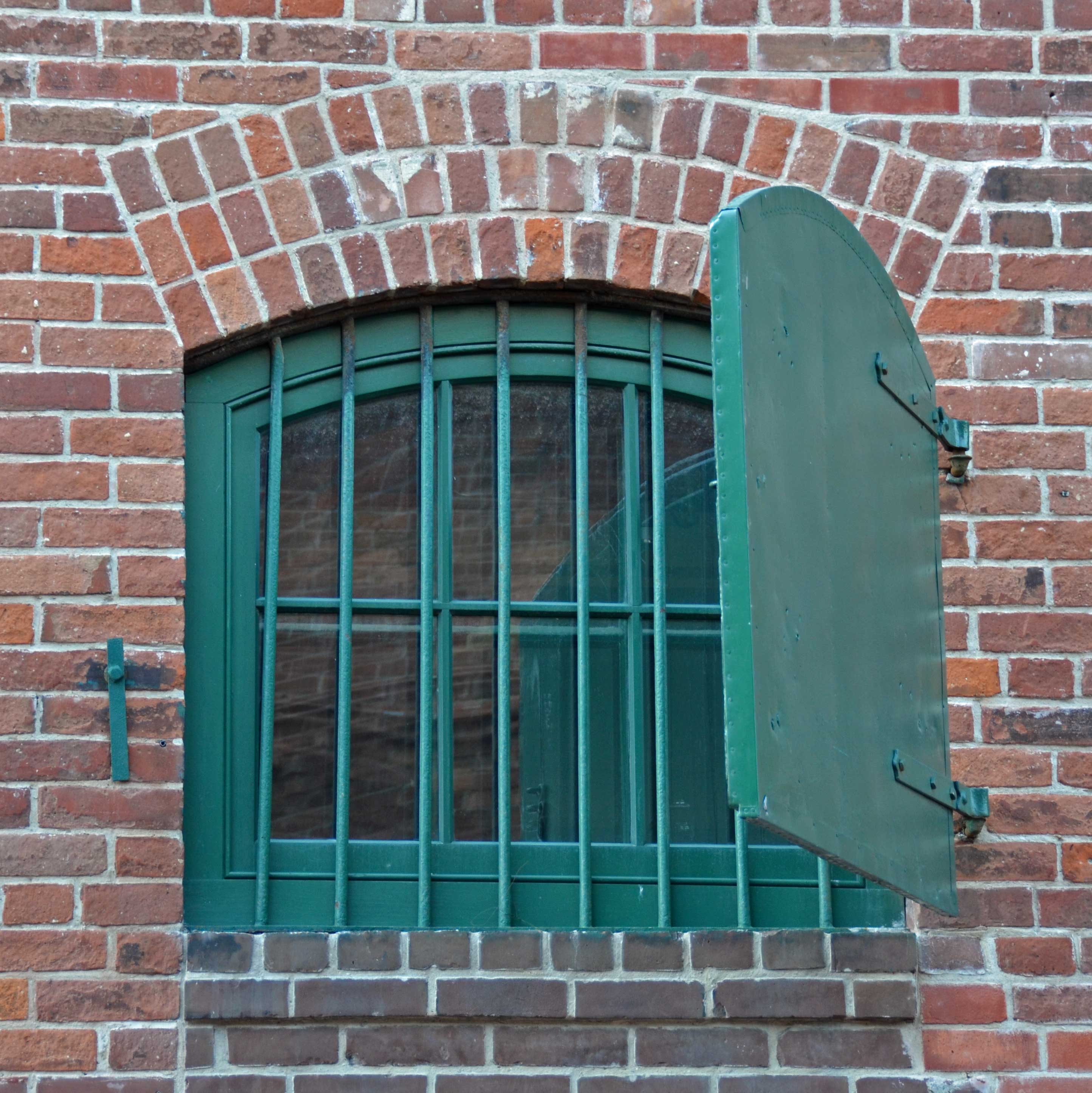
Bob Kebic, No. 2136
~
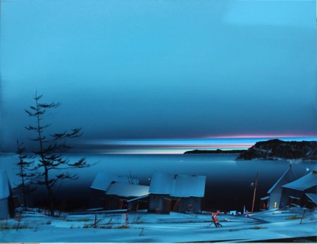
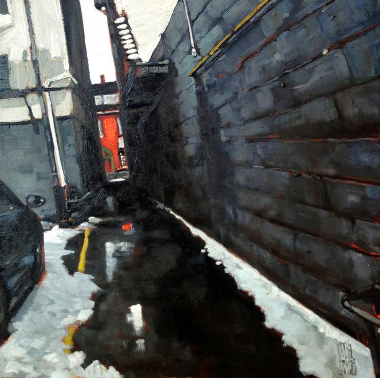
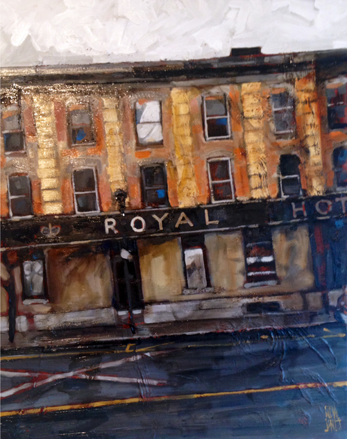
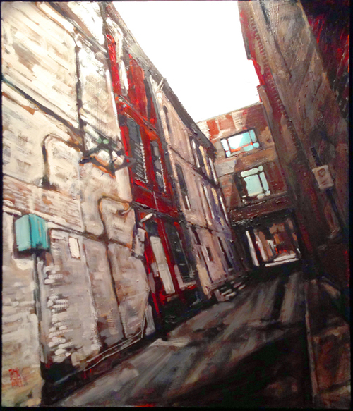
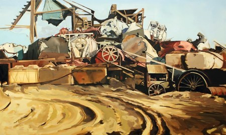
Visual poetry is what comes to mind as I contemplate the highly saturated colors and rich textures of Bob Kebic’s impressionistic landscape compositions. His paintings are truly exquisite and are reminiscent of the outdoors imagery popularized by certain of the Group of Seven artists, particularly that of Tom Thomson. However, Kebic’s imaginative canvases reflect a contemporary sensibility by incorporating a subtle cubist stylization of distinctive squared-off “blocks” and edges within many of his works.
As this small sampling indicates, Kebic notably only titles his paintings with numbers, an approach that he regards as allowing each viewer to bring their own experiences of nature and landscape scenery to a piece without being overly influenced by a title that is tied to a location or that is otherwise suggestive.
You can see more of Kebic’s inspiring paintings at his official artist site and at the gallery sites for Toronto and Winnipeg’s Mayberry Fine Art and White Rock, B.C.’s White Rock Gallery.

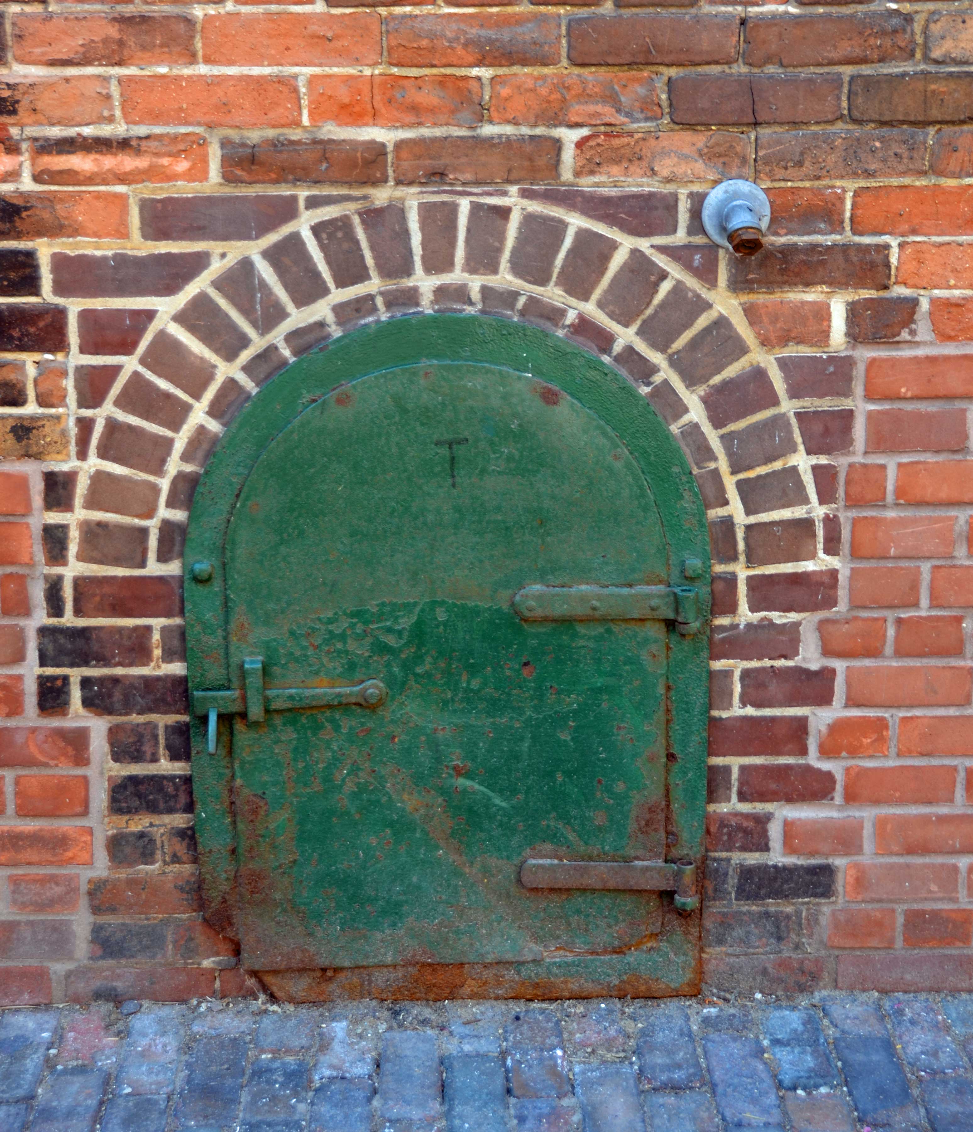
Bob Kebic, No. 2143
~

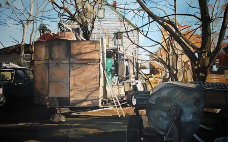
Bob Kebic, No. 1028
~

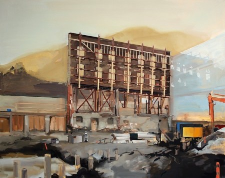
Bob Kebic, No. 1095
~

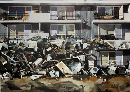
Bob Kebic, No. 2007
(Image credits: Bob Kebic)
Similar Posts on O’Canada:
• Amazing Landscape Artistry of Philip Buytendorp, Jennifer Woodburn and Steve Coffey
• David Pirrie: Mapping Western Terrains and Our Sense of Place
• Robert McAffee — Artist to Appreciate


 ⊕
⊕ ⊕
⊕


 ~
~


")