As a teenager I avidly collected coins, and even today, although I’ve not been collecting for years, I still scan my change for the occasional odd coin that might have some collectible interest. Some of the more prized items among the U.S. coins in my collection were my Peace dollars from the 1920s-30s, the Walking Liberty half dollars from about the same period and an early $5 Indian head “sunken design” gold piece. All this coinage was notable for exquisite and unmistakable design artistry. Yet, it is fair to say that U.S. coin designs of the past few decades are by and large staid and fairly boring. The few exceptions to this are the commemorative state quarters, some of the recent design variations on the reverse of the Lincoln penny and the Jefferson nickel, and possibly the Sacagawea dollar.
So, while recently thumbing through a subscription to one of my Canadian magazines, my attention was drawn to an ad by the Royal Canadian Mint for a special issue silver dollar marking the centennial of the Canadian Navy, which in turn caused me to visit the Mint’s website (www.mint.ca). I was aware of Canada’s 2004 issuance of the “red poppy” quarter, which was the world’s first general circulation coin using added color. Those coins stand out and you can’t help but wonder when you examine one closely why the colorful flower doesn’t rub off.

Quarter Coin, with Red Poppy (2004)
Besides having some quirky nicknames for its coins (such as the “loonie” for its $1 coin and the “toonie” for its $2 coin), it turns out that Canada has pioneered color coin technology in a number of its general circulation coins, as well as with quite a few mintages of other coins that are specially issued for collectors. In addition, there are coins with mixed metals, with embedded crystals and featuring holograms. This is pretty amazing stuff! (Canadians, do you know your Mint is doing this?)
Simply browsing the Mint’s website reveals numerous outstanding designs with themes touching upon all aspects of Canadian society. Coins routinely serve as constant reminders of significant cultural touchstones and the numerous offerings of the Mint attest to this function. There are too many coins on the Mint’s site that elicit my appreciation. What follows are just a few of these:
")
$20 Silver Coin, with Blue Snowflake Crystals (2009)
")
$20 Silver Coin, with Colored Maple Leaf and Crystal Raindrop (2009)
")
$20 Silver Coin, with Colored Lily and Crystals (2010)
")
$3 Silver Coin, Return of the Tyee Theme, with Pink and Yellow Gold Highlights (2010)
")
$1 Silver Proof Coin, The Sun Theme (2010)
 (2010)")
Silver Kilo Coin, Antique Finish, The Eagle Theme (2010)
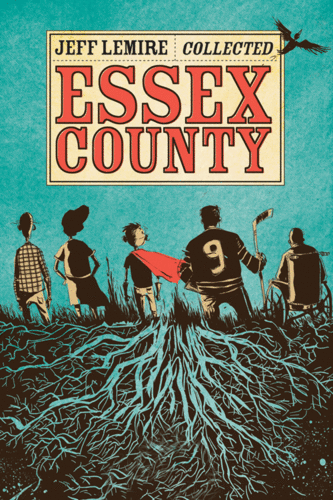


 I’m still exploring the Canadian graphic novel, so for now I’ll share a few thoughts on Canada At War: A Graphic History of World War Two, written by Paul Keery and illustrated by Michael Wyatt, which was published in 2012 by


")


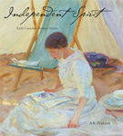
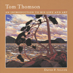
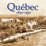
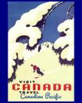