
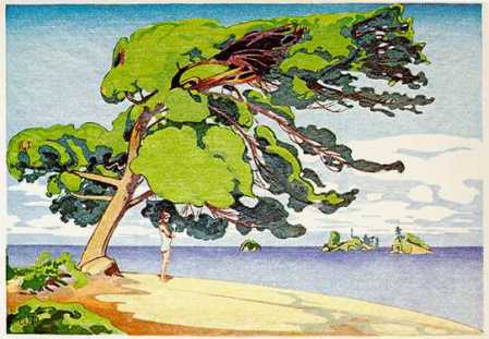
Red Sprigs Among the Rocks, Kejimkujik Seaside, N.S.
Red Sprigs Among the Rocks, Kejimkujik Seaside, N.S.
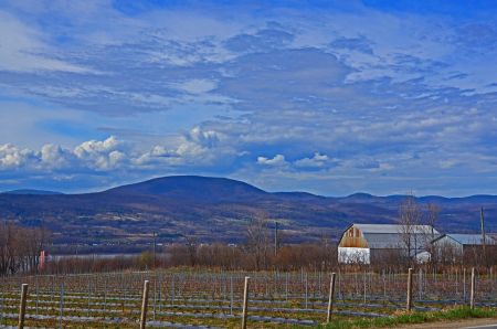
Early Evening, Gaspereau Valley, N.S.
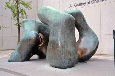
“Large Two Forms” (1966 & 1969), Henry Moore
Toronto’s diversity is reflected in the wide array of public art, especially sculpture, that can be seen on block after block in its downtown core. Encounters with public art as we hustle from place to place provide moments for reflection and inspiration and help to remind us of our connections to deeper things and to one another.
These pieces from out and about merely scratch the surface of the city’s offerings. (I forgot to get the titles for a couple of these pieces.)


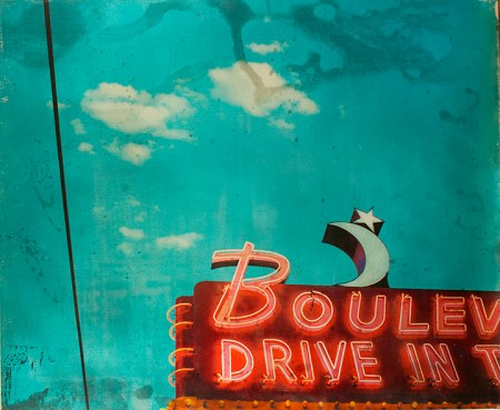
Angela Carlsen, “Boulevard Drive In”
If you take creative photography, neon signs and other roadside kitsch and mix them together with a retro-pop art sensibility, for me that’s a winning formula and is the approach taken by Nova Scotia-based artist, Angela Carlsen with her artwork. Much of her recent mixed media art focuses on bygone Americana as a result of her road trips over the last few years through the American West. Vanishing roadside relics, such as those depicted in this sampling, comprise a significant part of both the Canadian and America car cultures, and her work serves as a fitting artistic bridge between them.
You can see more of her retro art at Carlsen’s artist site here. She’s also represented by Argyle Fine Art in Halifax.
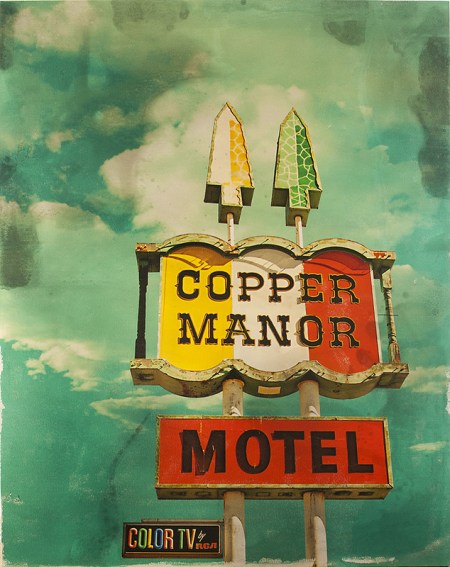
Angela Carlsen, “Copper Manor Motel”
~
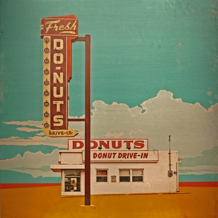
Angela Carlsen, “Fresh Donuts”
~
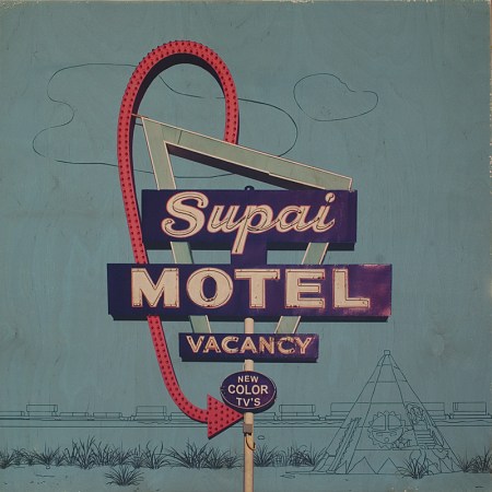
Angela Carlsen, “Supai Motel”
~

Angela Carlsen, “Four Winds Motel”
Related posts on O’Canada:
— Artist to Appreciate: Katharine Burns
— Artist Appreciation: Andrew Horne
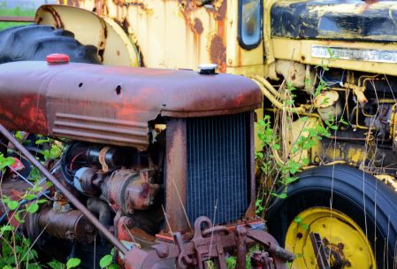
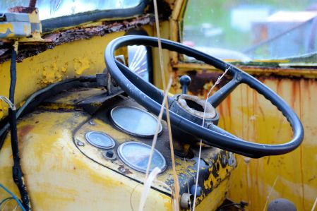
Abandoned barns, decrepit factories and broken down equipment fascinate me. I ponder the stories behind these once highly functional things that now rest in a decaying state. As testament to the utility of the wheel, the circular form is often present in such man-made landscapes. There’s also the mystery, mundane though it may be, about why particular discarded objects come to be abandoned in a given place and usually piled together randomly with other well-worn debris. The unkempt farm field, the ramshackle shed off to the side of a property or the makeshift junkyard along an overgrown path all withhold such stories.
These photos of old farm equipment are from just such a place alongside a back-country road I happened upon early one morning near Granville Ferry, N.S.


Related Posts:
— Andrea Kastner and Rejected Things
— Scenic Northville Farm Heritage Center, Annapolis Valley, N.S.
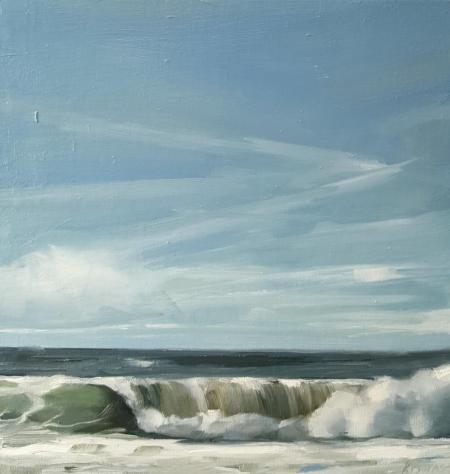 Katharine Burns, “Perfect Day”
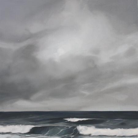
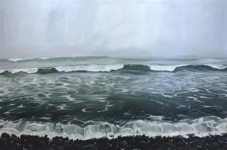
Capturing in a painting the emotion of the coastal landscape is a tricky thing and something that Halifax-based artist, Katharine Burns, has managed to do perfectly. Inspired by the serenity of Nova Scotia’s beautiful shores (one of my favorite places!), she skillfully renders the movement of ocean waves, with varying shades of light dancing across the water’s constantly shifting surface beneath vast expanses of cloud-covered skies. This past August, Burns had her first (of what I’m sure will many other) well-deserved solo show, this one entitled “Sea Level” and held at Argyle Fine Art in Halifax, which showcased many of her seascapes.
On her artist site she notes: “Preparing for my first solo show was one of the hardest things I’ve done. For six months I went through periods of serious self doubt and frustration along with some moments of sudden realization and inspiration. It was a bit of a rollercoaster for me emotionally but I learned a lot and grew as an artist.” You have to root for that sort of spirit and candor!
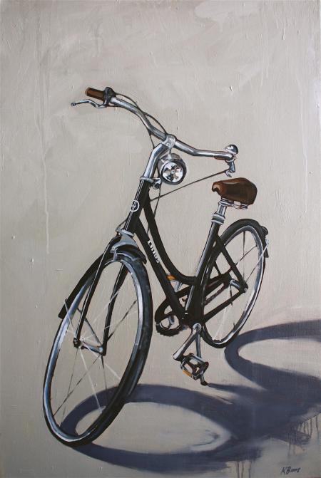
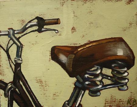
In addition to Burns’ evocative seaside paintings, her other work is also terrific. I especially like the painterly style of her series of bicycle paintings, a few of which are below. More of her art can be seen on Burns’ artist site here.
[As an side, much like the Ian Tan Gallery on Canada’s West Coast, Argyle Fine Art on the East Coast has a stellar roster of emerging and established Canadian artists and both are among my favorite independent art galleries. As I’ve done with some Ian Tan Gallery artists, this is the first of several posts I’ll be doing on a few artists represented by Argyle whose work deserves greater attention.]
Katharine Burns, “Diffused Light”
~
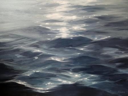
Katharine Burns, “Glisten”
~
Katharine Burns, “Lawrencetown”
~
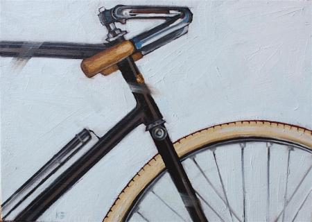
Katharine Burns, “Road Racer”
~
Katharine Burns, “Linus”
~
Katharine Burns, “Bicycle Series 2”
~
Katharine Burns, “Marginal Road”
~
Related Posts on O’Canada Blog:
Lyssa Kayra’s Inspired Tree Ring Art
Intricate Pebble Paintings by Kristina Boardman
David Pirrie: Mapping Western Terrains and Our Sense of Place
Andrea Kastner and Rejected Things
Artist to Appreciate: Richard Ahnert
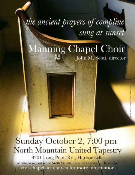
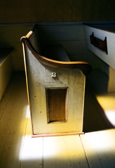
I’m definitely an amateur photographer at best. So I was pleased to be asked recently to allow a photo I’d taken of a simple, well-worn pew inside an old church on the Nova Scotia shore to be used for a poster for an upcoming concert by Acadia University’s distinguished Manning Chapel Choir. Of course, I was more than happy to do so (and the request made my day)!
The sunset concert of Compline, or night prayers, will be sung, appropriately, in a former old church in the small town of Harbourville on the Bay of Fundy about a week before Canada’s Thanksgiving Day. The concert poster is above and the original blog post and series of photos that prompted the request is here. More about the concert and the Manning Chapel Choir can be found here.

Headstones, Old Burying Ground, Halifax
~
Given its immense size, Canada is blessed with vast forests, sprawling farms and sweeping fields all of green. Adding to previous posts featuring red- and blue-themed photo galleries, this collection showcases many shades of green that I’ve encountered through my photos from coast to coast across Canada.


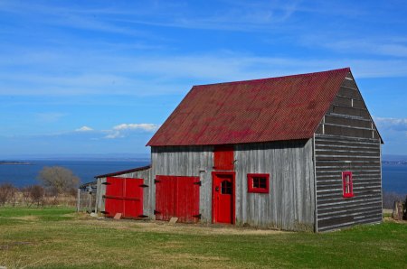
Rustic Barn with Red Doors, Windows and Roof, Ile d’Orleans, Quebec
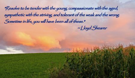
“I’m so glad you’re here . . .
It helps me realize how beautiful my world is.”
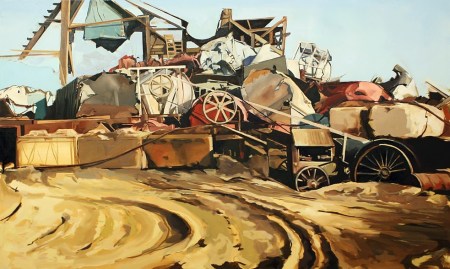
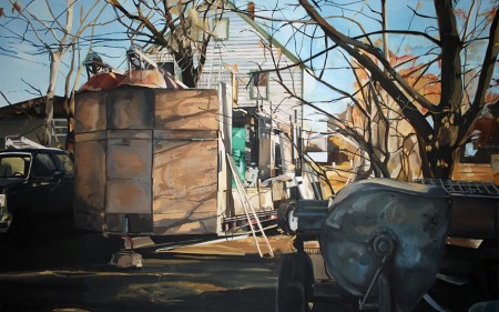
Andrea Kastner, Progress (2014)
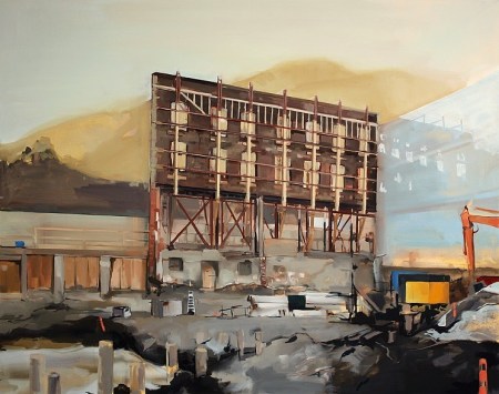
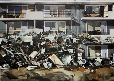
Andrea Kastner is an up-and-coming young painter whose art deals with what she calls the “sacred nature of rejected things” and the stories that underlie society’s no longer useful objects, structures and places. The scenes she paints are ones that are readily familiar in urban landscapes across Canada and the U.S., with the constancy of the old being torn down or pushed aside as detritus to make way for the new.
Kastner is originally from Montreal, studied art in New Brunswick and Alberta and until recently was based in Hamilton, Ontario. She is now located in the creative town of Iowa City, Iowa. More of Kastner’s terrific work can be seen at her artist website here.
Andrea Kastner, Noah’s Ark (2013)
~
Andrea Kastner, The One That Got Away (2013)
~
A. Kastner, The Inventory of Dreams (2014)

Small Fishing Boat, Near Port Rexton, Newfoundland
I love playing around with themes. In an earlier post, I grouped together a bunch of my photos from across Canada that featured a strong element of red. Today, I thought I’d do a similar thing with some photos that incorporate blues (of the uplifting kind).


")


Postcard of Helen’s Motel, Near Quebec City (1950s)

The Atlantic Advocate was a general interest magazine published monthly from 1956 through 1992 with a focus on life, culture and business in the four Atlantic provinces — New Brunswick, Newfoundland, Nova Scotia and Prince Edward Island. While browsing through a stack of issues from the late ’50s and early ’60s, one of the things that stood out to me was the enthusiastic boosterism of many ads promoting economic development and tourism in those places. The fact that ads of this nature are so prominent in a general interest publication is partly a testament to the economic challenges long faced by the Maritimes and an appreciation by their relatively small populations of the significant impact of industry and natural resources development on daily life in their regions.


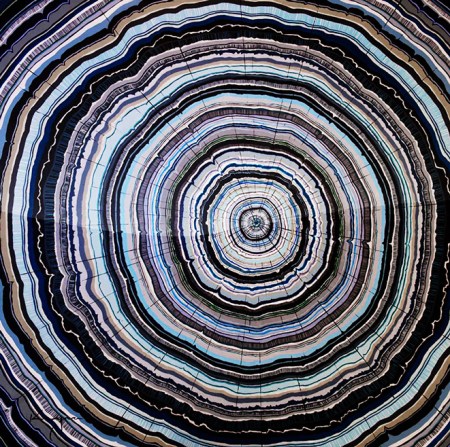
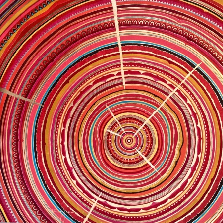
Lyssa Kayra, Vancouver’s Winter (2016)
Lyssa Kayra’s art is striking! I love her skillful use of colors and her expressive creativity. Her imaginative large-scale paintings use the form of tree rings — the natural design of which alone makes an intriguing subject and which is suggestive of time and memory — as a means of conveying ideas about specific places that have influenced her.
More info about this wonderful young Vancouver-based artist and her gorgeous work can be found on her artist site here.
Lyssa Kayra, Adjuna Textile, India (2015)
~

Lyssa Kaya, Berlin Wall (2015)
~
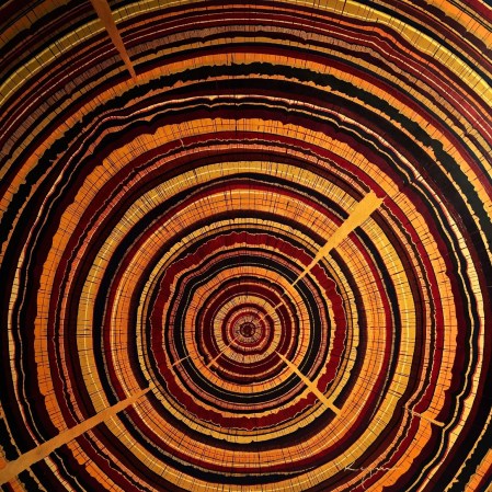
Lyssa Kayra, Sahara (2015)
~

Lyssa Kayra, Purple Study (2016)
~

Canada Forestry and Paper Pavilion
With the Rio Summer Olympics being just around the corner this prompted me to ponder the differences between the Olympics and the World Fairs. While both are cultural showcases that bring together people of many nations to good-naturedly preen about their countries, World Fairs seem more ad hoc than the more structured, media spectacle of the Olympics.
Coinciding with Canada’s centennial in 1967, Montreal hosted what is considered to be one of the most successful World Fairs, which was the first to adopt the “Expo” moniker by which all subsequent World’s Fairs have been named. As attested by these postcards, the various national pavilions at Expo 67 served as grand displays for then cutting-edge, very “mod” design and innovation.


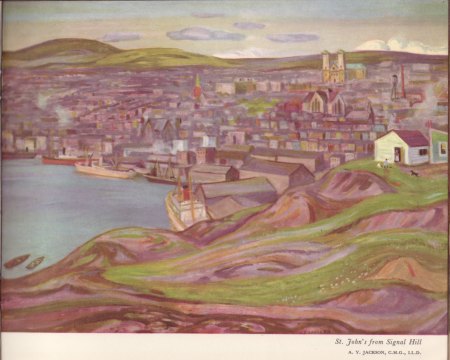
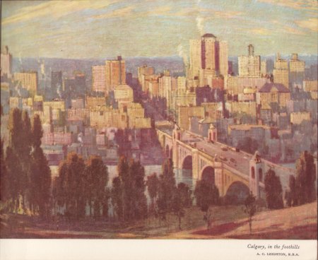
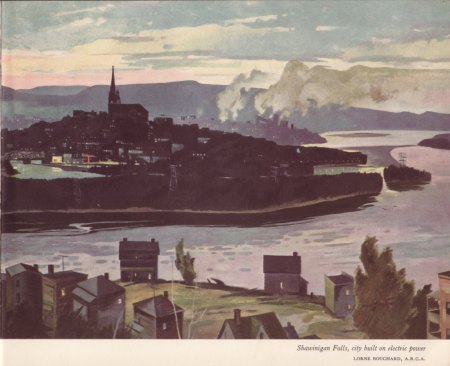
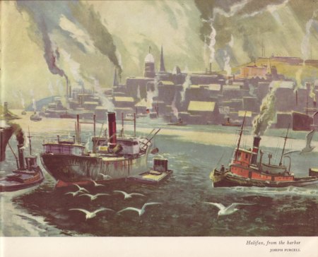
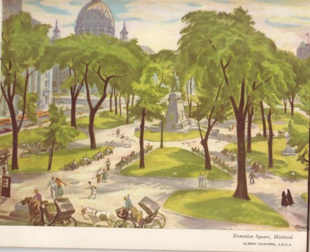
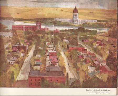
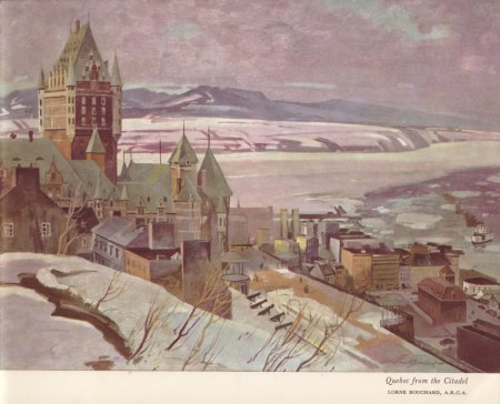
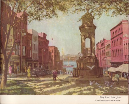
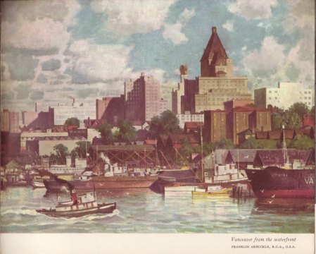
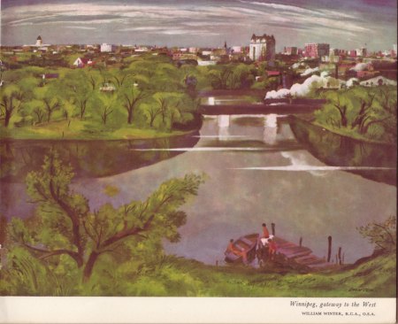
For Canada Day weekend, this post features images that span the geography of this vast country. Around 1953, in a grand display of national pride, the Montreal-based alcohol and beverage giant Seagram Company commissioned over a dozen Canadian artists (including several among the famed Group of Seven) to create a series of watercolors of major Canadian cities. The paintings were subsequently the focus of a world tour organized by Seagram to showcase Canada and its urban landscapes.
While recently rummaging through an antique shop I came across a small booklet, dating to 1953, in which these paintings were reproduced and for which this post shows a sampling of the now somewhat faded images. While many of the provincial capitals are depicted, I find the inclusion of several less prominent cities (including Fort William, Hamilton, Sarnia, Shawinigan Falls and Trois Rivieres) to be fascinating.


Blossoming Peach Grove, Wolfville, N.S.
“The world is full of magic things, patiently waiting for our senses to grow sharper.”
~ William Butler Yeats
Not far from the Bay of Fundy shore of the northern Annapolis Valley sits this very old and humble Baptist church. The colored glass windows are adorned simply with a subtle yellow-hued cross motif and a few complementary colors in the other panes. Every weathered detail of its cedar-shingle exterior and its intimate understated interior testifies to its long history and the many lives and life-stories that have been shared within.


 Moose River, Clementsport, N.S.
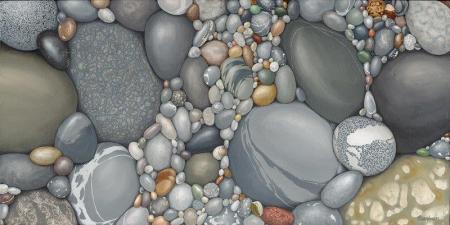
Kristina Boardman, “Cara’s Pebbles”
Photo-realistic paintings, such as these by BC-based artist Kristina Boardman, easily fool the casual observer as well as the more-studied eye. That’s amazing enough! But in addition, these works of pain-staking exactitude nicely capture the whimsy and pleasure of surveying a shoreline adorned with swaths of smooth-faced multi-colored stones and pebbles that have been thrown together randomly over long periods.
Although the realism of these paintings dictate a dominant blue-gray hue, Boardman wonderfully conveys nuance within that muted palette and complements this with perfect pops of other earth tones and pleasing juxtapositions of size and shape. The compositions of some of these images, such as “Cara’s Pebbles” (above), suggest small jewels just underfoot.
Among other venues, her work is available at the Ian Tan Gallery in Vancouver and can also be viewed on Boardman’s website here.
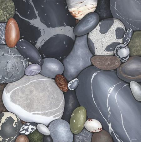
Kristina Boardman, “Communication”
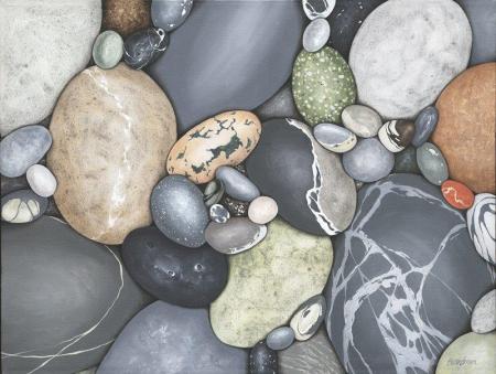
Kristina Boardman, “Saltspring Sunday”
Farm Overlooking the St. Lawrence River and the Laurentians, Ile d’Orleans, Quebec

Astrid Blodgett’s recently published first collection of short stories, You Haven’t Changed A Bit (Univ. of Alberta Press 2013), is stunningly well written. As I finished the book for the second time, I reflected how these stories brought to mind Rainer Maria Rilke’s observation about how each of us cannot help but be a mysterious solitude in relation to one another and, most especially and paradoxically, to our closest loved ones.
Almost all the thirteen stories in this wonderful volume explore fissures in relationships — whether between spouses, partners, siblings, parent-child or friends — and the unspoken mental landscape that inexorably shapes those relationships. Notably, most of these tales are told from the perspective of a female character, who mainly endure the emotional pain that accompanies varying degrees of psychic distance from a loved one.
A small sampling: In “Don’t Do a Headstand” a visit by her husband’s pregnant teen niece highlights the growing and likely irreparable gap between the spouses. “Zero Recall” explores the toxicity of a husband’s mistrust and the wife’s ensuing bitterness at being treated unfairly, both of which threaten the couple’s bond following an unfortunate mix-up at a blood donation center. The realization by young adult friends that divergent life paths will impact their ties in “Let’s Go Straight to the Lake” is skillfully elicited by the piece’s authentic, slightly awkward dialogue and scene-setting. Several of Blodgett’s stories are especially poignant, particularly “Ice Break,” about fragile parent-child relationships and the weight of guilt from choices that can’t be undone. This latter story is one that I’ve written about previously and compelled me to seek out more of Blodgett’s captivating writing.
In an effort to stick with my preference for conciseness, I’ll conclude by simply noting that each of the stories in You Haven’t Changed A Bit is a pitch-perfect gem, characterized by truly graceful and insightful writing by a talented writer who is worth every bit of your attention.
Astrid Blodgett
More information about Astrid Blodgett and her writings can be found at the author’s website here.
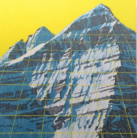
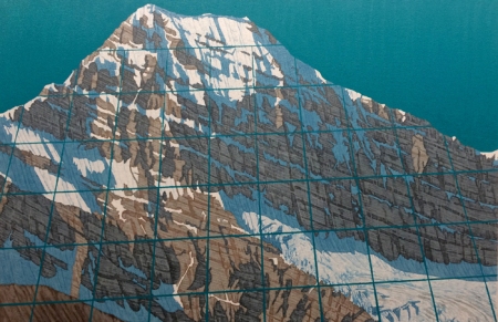
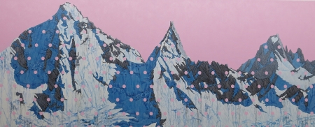
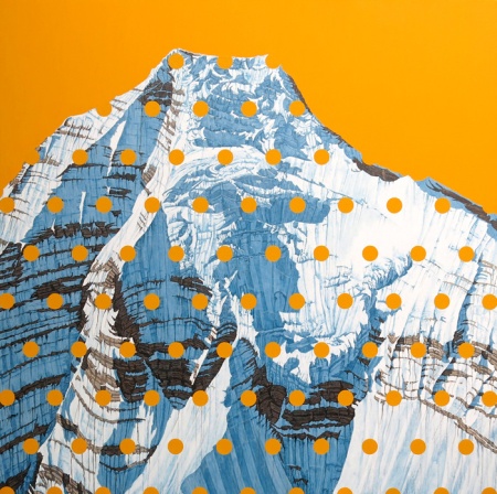
David Pirrie, Mt. Phillips, BC Rockies (2016)
There’s a great deal of pleasure to be found studying maps, replete as they are with seemingly arcane symbols, dots, lines and grids awaiting patient deciphering. Among the fascinations of Vancouver-based artist David Pirrie is the iconography of maps and how they influence our sense of place, which he nicely explores in a wonderful series of paintings recently exhibited at Vancouver’s Ian Tan Gallery.
Pirrie’s paintings of Canada’s western landscape, particularly of mountains in the Alberta and British Columbia Rockies, are overlayed with mapping details and pastel hues that display a slight pop art sensibility that is both intriguing and pleasing. His having climbed many of these mountains adds an element of intimacy to his gorgeous representations of these majestic formations.
More of David Pirrie’s work can be seen at his website here.
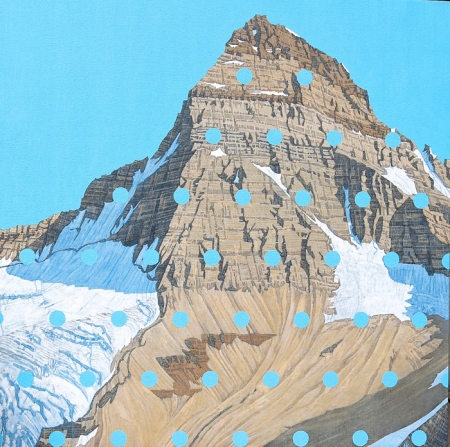
David Pirrie, Mt. Assiniboine, Late Summer(2016)
~
David Pirrie, Columbia Icefield , 1/50,000 (2016)
~
David Pirrie, Mt. Edith Cavell (2016)
~
David Pirrie, Kates Needle, BC Coast (2013)
~
David Pirrie, Mt. Robson Ice Fall (2016)
~

Annapolis Royal, Nova Scotia, is a charming community whose vibrancy is hinted at by the variety of colorful shop signs and other markers found along the town’s main street. This sampling — I know I missed a few (my apologies) — suggests as much.


Walter J. Phillips, York Boat on Lake Winnipeg (1930)
Walter Joseph Phillips is yet another unquestioned master of magnificent woodcut images of the Canadian landscape. He often printed his artwork in color inks rather than just black ink as used by many of his contemporaries working in the same medium. Although born in England, he settled in Canada as a youth and resided in Winnipeg, Manitoba for much of his life (the same place, coincidentally, chosen as a newfound home by another exceptional Canadian woodcut artist and fellow European immigrant, Eric Bregman). Phillips produced the bulk of his work from the late 1910s through the 1940s. In many of his images of the Canadian west he situated people within the scene, providing both a sense of scale and nice human emotional element.

Walter J. Phillips, Mount Cathedral & Mount Stephan (1928)
Walter J. Phillips, Lake of the Woods (1931)

Walter J. Phillips, Red River Jig (1931)

Walter J. Phillips, The Clothesline –Mamalilicoola (B.C.) (1930)

Walter J. Phillips, The Stump (1928)
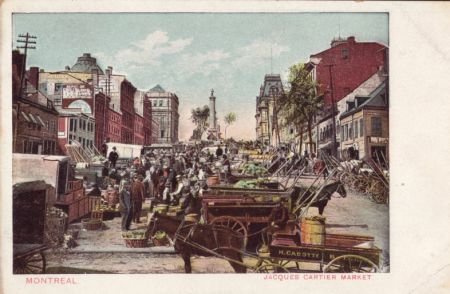
Jacques Cartier Market, Montreal, Early 1900s
~


Similar Posts on O’Canada:
• Bridges As Depicted in Vintage Postcards
• “Having a swell time . . .”: Vintage Hospital Postcards
• The Great Canadian Outdoors: Vintage Rockies Postcards
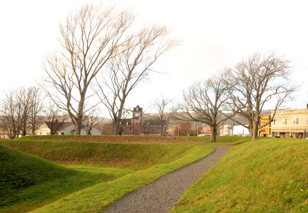
Pathway Near the Earthworks, Fort Anne, Annapolis Royal, N.S.

Hillside Cannon, Fort Anne, Annapolis Royal, N.S.

H. Eric Bergman, “White Morning” (1932)
The intricate artistry of wood engravings amazes me and Canada has its fair share of accomplished artists in this medium. Chief among them is H. Eric Bergman, who emigrated from Germany in 1913 and made Winnipeg, Manitoba his home throughout a highly productive career until his passing in 1958. Images from the Canadian wilderness figure prominently in many of his very stylized and moody works.


Similar posts on O’Canada:

Front Cover Illustration by Reginald Knowles for Helen Creighton, Songs & Ballads from Nova Scotia (1933)
In the late 1920s and early 1930s, Helen Creighton, a then-budding musicologist, set about criss-crossing Nova Scotia to collect songs peculiar to the province. In 1933 she published 150 of these songs in Songs & Ballads from Nova Scotia, the first of her many song collections.
I had the good fortune recently to come across a lovely first edition of this book and have enjoyed thumbing through it, while marvelling at the laborious effort reflected in its pages. Here may be found songs of the sea, of love and its missing, of battle, of children’s play, as well as connections to the English, Scottish, French, Acadian and Mikmaq influences on this rich local music. The book’s front and back covers are graced with an exquisite woodcut by the noted illustrator, Reginald Knowles, and depict scenes suggestive of the songs within.

Title Page, Helen Creighton, Songs & Ballads from Nova Scotia (1933)
~

“Homeward Bound,” from Helen Creighton, Songs & Ballads from Nova Scotia (1933)
~

Frontispiece Illustration by R. Wilcox for Helen Creighton, Songs & Ballads from Nova Scotia (1933)
~

Back Cover Illustration by Reginald Knowles for Helen Creighton, Songs & Ballads from Nova Scotia (1933)
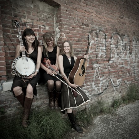
The Sweet Lowdown is an amazingly talented folk and roots music trio based in Vancouver Island, B.C. The group consists of Amanda Blied on guitar, Shanti Bremer on banjo, and Miriam Sonstenes on fiddle. Their wonderful harmonies and skillful musicianship and songwriting are starting to attract much-deserved wider recognition, including coveted nominations by the Canadian Folk Music Awards as 2015 Ensemble of the Year and 2015 Roots Group Recording of the Year by the Western Canadian Music Awards for their album “Chasing the Sun”.
The video above is for “Red Shift Blues”, a soulful tune from the band’s 2011 self-titled album “The Sweet Lowdown”. More info on them and their music can be found on their official band website.
(Photo Credit: Ashli Akins)
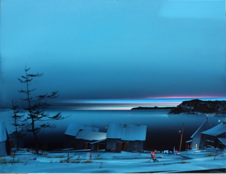
“The Dream Country” by Andre Philbert
It’s definitely heavy coat and neck scarf weather around here, as it is in many places this time of year, so thoughts of winter cold are unavoidable. This painting, “The Dream Country,” by Montreal artist, Andre Philbert, with its overwhelming shades of blue and houses set with jaunty rooflines perfectly captures the quiet chill of this time of year. More of Philbert’s deep-blue winter landscapes can be seen at the site for Toronto’s Liss Gallery.

Like P.E.I.’s fame for its mussels harvest, Digby, N.S. is widely acclaimed as a source for some of the East Coast’s best scallops. The Harbor in Digby is a bustling place as the local fishing fleet accounts for its daily labors. These photos are from around dusk as things were winding down a bit.


